New Site Makes Reading Solar Data Easy and Fun

U.S. states color=coded by number of PV installations | Image courtesy NREL Open PV Project
Have you ever thought you'd like to learn more about how the U.S. solar photovoltaic scene has grown, but then recoiled at the prospect of wading through hundreds of arcane spreadsheets? The National Renewable Energy Laboratory (NREL) has a new tool for you. Or should we say "toy"? The Open PV Project provides an accessible, intuitive, and in fact fun way to take a look at photovoltaic installations in the U.S. And best of all, it's free.
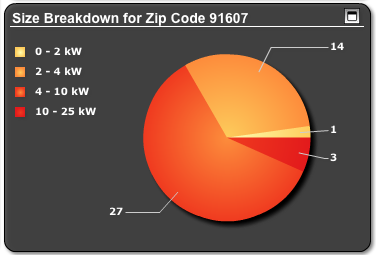
NREL's Open PV project takes real-time data on all the photovoltaic installations in the United States -- 162,910 of them at this writing, for over 2 gigawatts of generating capacity -- and, well, visualizes that data for you so that you can get a nearly intuitive sense of what parts of the country are lagging behind in PV installations, how much PV costs in different parts of the country, and even which neighborhoods in your city are the most solar-happy, or -- as shown below -- what size PV installations NREL knows about in, say, Valley Village.

PV setups by size in the 91607 | Image courtesy NREL Open PV Project
The site's Market Mapper lets you examine data for any state, county, city, or ZIP code ranging from the number of PV installations in the last year, average installation cost per watt, generating capacity, and how installation costs have changed since 1998. It's a useful tool for a number of things, including winning those bar-room arguments about how rooftop solar is just too expensive. (Hint: Installation prices have dropped steadily over the last decade, and the Open PV Project offers abundant proof.)
Even if crunching numbers isn't your thing, you'd do well to check out the Open PV Project's "Time Mapper," an animation of photovoltaic installations in the US from 2000 through this year. The animation rolls through that period a day at a time, adding a tiny flash for each new photovoltaic system, and though it starts slow the effect by the time you get to 2002 or so is pretty remarkable: the state of California looks like it's on fire with PV installations, with New Jersey following suit a year or so later.
It will not surprise you, after watching the animation, to learn on the site's state rankings page that California is far and away the leader among the states in photovoltaic installations and capacity, with 109,372 installations at this writing -- more than all the other states combined.
NREL's data isn't complete, and they say so up front. They've collected their data from utilities, state agencies, and solar installers across the country, but they admit it's just a start. That's why perhaps the most far-reaching aspect of the Open PV Project is the "open" aspect: if you have a photovoltaic installation that isn't listed in their database, you can add it yourself through the site's interactive spreadsheet. NREL will assess the cloudsourced data, toss out the obvious junk, and add the figures to their national database.
Its citizen participation and government science at its best, and other federal agencies wanting to share information with the public would do well to study NREL's work very carefully.
ReWire is dedicated to covering renewable energy in California. Keep in touch by liking us on Facebook, and help shape our editorial direction by taking this quick survey here.